Poster Research

Looking at a few examples of posters I have discovered the type of information needed to be on the posters for our exhibition. The name of the exhibition,where its going to be held (location/address), A small description about the exhibition, what it includes with a photographs from the exhibition collection (a preview), the date of the exhibition along with times (e.g 6-11pm)
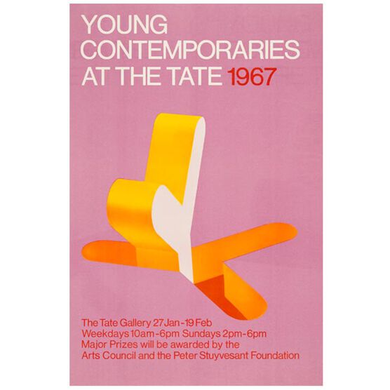
Young Contemporaries vintage poster

They may also consist of who is going to attend, major people in the art industry or judges that will attract people to come and support artists in the competition.


Bibliography 

POSTER, Y.

Young Contemporaries (Tate vintage poster reproduction) | Posters | Tate Shop | Tate

In-text: (poster, 2019)

Your Bibliography: poster, Y. (2019). Young Contemporaries (Tate vintage poster reproduction) | Posters | Tate Shop | Tate. [online] Shop.tate.org.uk. Available at: https://shop.tate.org.uk/young-contemporaries-vintage-poster/14320.html?cgid=exhibition-posters [Accessed 22 Jan. 2019]. (First poster)


BEHANCE

In-text: (Behance.net, 2019)

Your Bibliography: Behance.net. (2019). Behance. [online] Available at: https://www.behance.net/gallery/35823375/AUAD-Poster-Exhibition [Accessed 22 Jan. 2019].

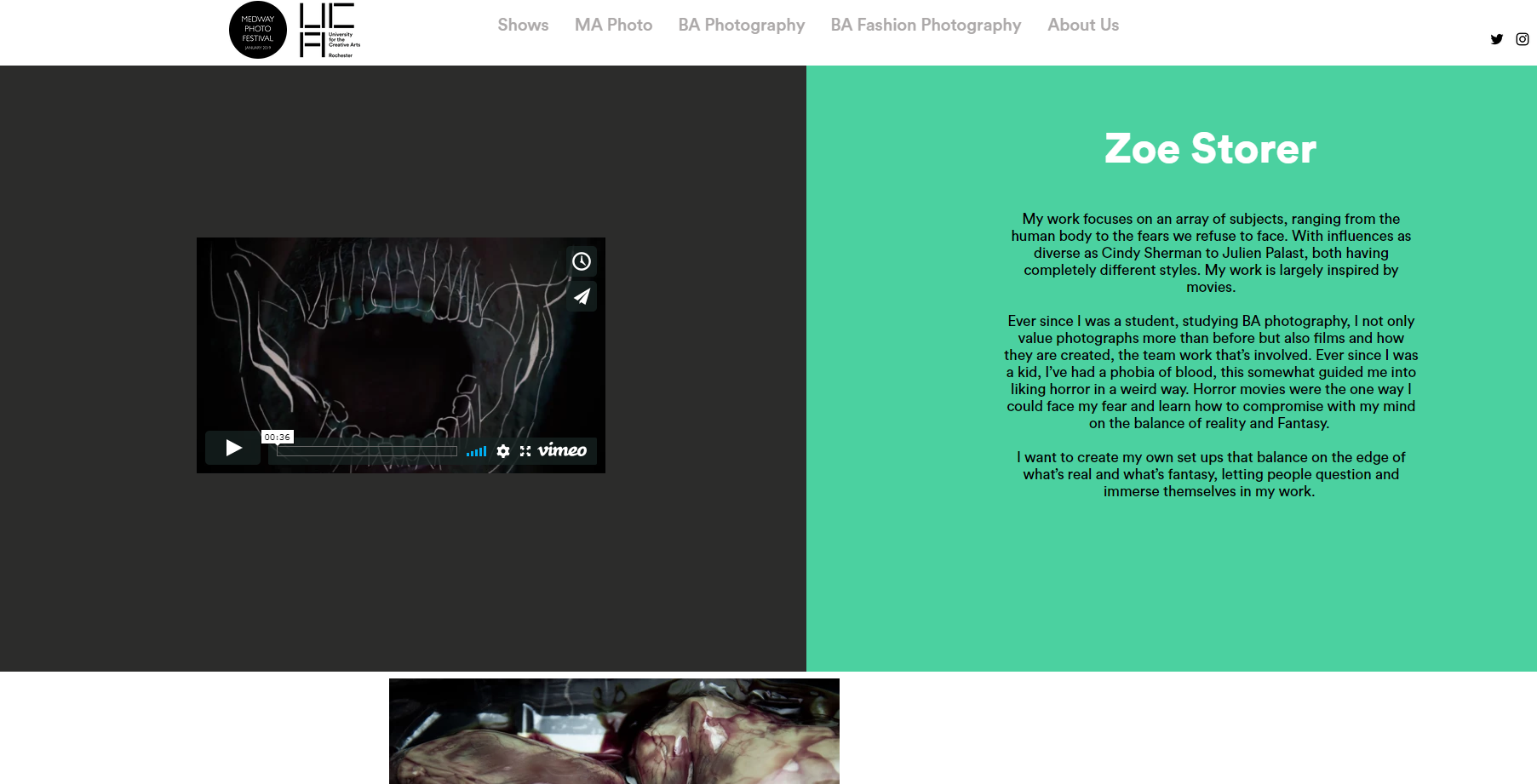
 

Zine and Website

A Zine and Website were created for our exhibition. This was to help promote and give our audience more information about the exhibition and what was featured in it.

The home page for our website was the Medway photo logo.

IMG_2147.JPG

When continuing into the website you need to select one of the 5 categories that contain other subtitles which lead you to pages with information about those sub titles. Our category is “BA Photography” this holds all our names as subtitles below which steers you to our own pages showing our Artist Statement and our work.

My page

Our Zine came together and was an amalgamation of all our own created layouts which were later altered to fit a new layout for the zine, creating a theme. I did this on Indesign.

IMG_2149.JPG
Layout I created

Posters

The poster below was designed for the exhibition. We had the posters printed in both A3 and A4 sizes and distributed them around the University and surrounding area.  We printed smaller versions for leaflets and placed them in communal areas and handed them out to people.  Advertising via posters around the University helped us to capture a larger audience because this was a University of the Creative Arts people are more likely to be interested in coming to an Art related event.  However, we also distributed posters and leaflets to people who had access to places in the local of Chatham and Rochester.

This poster is in the printing lab in the Photography department.

Below is a poster I created which included, the Medway photo festival logo, Uca (our Universities logo), the name of our exhibition (Kaleidoscope), a short description (Created by other members of the class), the Address of the gallery, dates and times of the exhibition, mainly focusing on the open evening.  I created the poster in Photoshop and found the logos on our website. I decided to use a  black background with white text as it felt more dramatic. However, this was not the poster we chose to use for advertising the Exhibition because the cost of printing would be higher than that on a White background.

poster fix


Instagram post

Whilst looking for inspiration on Instagram I came across some interesting layouts and thought it would be a unique way to promote our exhibition.  Instagram Puzzles, these are multiple posts that come together to create a large Image when looking at the overall view of the Instagram account.  

Above is a screenshot I took of “Chic.geeks” Instagram page,  a small business selling cases for Mac Books. This was one of the images that inspired my Instagram puzzle post.

I used three posts merged into one to create a large image promoting our exhibition.  Like a puzzle, the single posts came together to form one large image below:-

insta plan out black.jpg

I used the agreed logo and name of the exhibition, Kaleidoscope.  However I decided to use a black background rather than white as used for the final poster/Instagram post. After researching other exhibition posters/posts I understood what should be included when promoting an event:-

  • Name of the exhibition (Kaleidoscope)
  • Logo of the Exhibition
  • Name of the Festival (Medway Photo Festival 2019) along with their Logo
  • Location
  • Date and Times
  • A small description about the exhibition. (This was created by another member of the class and was featured on all of the promotional posts)
  • Our University logo
  • The Instagram account we were using for the exhibition.

Sometimes communication with others in my group was difficult as responses were  very slow, I found this quite frustrating.  Because of this for some of the work I just used the information I had to hand plus the logo.

one post kaleidoscope

I eventually decided upon the above single post, as this was easier to put on Instagram  and get the message across in such a short amount of time. The advertisement was also delayed as we were not given the opening time until less that a week before the Exhibition opened.

we made the decision to posted this on the UCAphoto page because it already had an audience.

CHIC GEEKS (@CHIC.GEEKS) • INSTAGRAM PHOTOS AND VIDEOS

In-text: (Instagram.com, 2019)

Your Bibliography: Instagram.com. (2019). Chic Geeks (@chic.geeks) • Instagram photos and videos. [online] Available at: https://www.instagram.com/chic.geeks/ [Accessed 20 Jan. 2019].


Instagram Post

We made an Instagram post to go on the UCAPhoto Instagram which will hopefully inform people from the local area that the exhibition is on and when and where it is. The advert was made from the poster and cropped down to fit a square ratio. Some also put the poster on their Instagram story to let their friends know the exhibition is on.

This initial crop was later amended to fit the Instagram layout better, a black layout will stand out better on the white Instagram design and the double colourful logo works well to frame the details.

Posters

Posters were made for our exhibition which included the date and time of the opening event and the logo and name. These will be printed and put up around uni to advertise the opening event and exhibition as it also includes when it runs until.

The other version is an artist statement which tells people deeper about the themes of the exhibition, giving detail about our project brief around mixed media.

There was also a board created by the Sun Pier House which shows the same things as our posters but in a layout that fits their aesthetic.


Website

We had a Medway Photo Festival website to showcase our work and effectively carry out the same function as the zine, but on a digital platform, where all of the shows are available from the BA courses to the MA. It also shows where the exhibitions are being held and directions from a link to maps. Previews of the work are shown with portraits of the creator and an explanation of the working processes.

https://www.medwayphoto.com/

production of the zine

as a class, we produced a small zine to showcase our work and also to give a short bio about ourselves, we each designed our own page for the zine and then afterwards put them together in one file,

The production of the zine was a simples process one we had collected all the pages together we printed them on to normal paper and folded stapled and cut them down to size.